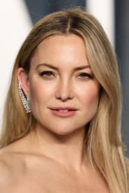
Kate Hudson's Color Season: Light Spring
Kate Hudson's color analysis maps to Light Spring — a warm undertone at light depth within the twelve-season system. If your own seasonal color analysis matches those traits, the wear-and-avoid colours below are yours too.
Think you share Kate's season?
Free Light Spring color analysis →Why Kate is a Light Spring
- Undertone
Golden warmth in the skin — gold jewellery and warm-based colours harmonise naturally.
- Depth
Light overall colouring — delicate colours keep the natural lightness from being overpowered.
- Season quality
The overall effect is fresh — the defining quality of every Light Spring, Kate included.
If you look like Kate
Share Kate's warm undertone and light depth? The Light Spring palette is built for exactly that colouring. Start with Peach, Warm Ivory, Light Camel in tops and scarves, then build neutrals from the wear column above.
The Light Spring palette
Light Spring colouring is warm, delicate, and sunlit — light golden skin, light warm hair, and soft brightness in the eyes. The palette keeps everything light and warm: think peach, warm ivory, and soft aqua. Heavy dark colours overwhelm this colouring instantly.
Colours that flatter Kate — and you, if you're Light Spring.
Colors to wear
Colors Kate would avoid
Styling tips for Kate's Light Spring colouring
- Gold jewellery and warm metal hardware complement the skin without pulling yellow.
- Keep outfit contrast soft — mid-tone colours rather than harsh black-and-white pairings near the face.
- For makeup, Kate's Fresh colouring suits Peach-leaning lip and cheek tones from the wear palette — avoid the greyed or off-season shades listed above.
Light Spring vs True Spring
Kate is mapped to Light Spring — Warm, Light, Fresh — rather than True Spring (Warm, Clear, Golden). If warm coral and golden yellow suit you but icy pastels do not, Light Spring is the stronger fit; if you need lighter, softer colours, compare the True Spring palette too.
All Light Spring celebrities → · All True Spring celebrities →
More Light Spring celebrities
 Madelyn ClineActress (Outer Banks)Shares the Light Spring colour range — compare palettes side by side.
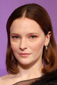 Morfydd ClarkActressSame Light Spring palette — similar undertone and depth.Nastya KusakinaModelLight Spring match with a warm undertone profile.Noa VermeerModelShares the Light Spring colour range — compare palettes side by side.
 Phoebe DynevorActress (Bridgerton)Same Light Spring palette — similar undertone and depth.
 Renée ZellwegerActressSame Light Spring palette — similar undertone and depth.
Explore related seasons
Frequently asked questions
- What color season is Kate Hudson?
- Kate Hudson is classified as a Light Spring in the twelve-season color analysis system — a warm undertone at light depth.
- Is Kate warm or cool toned?
- Kate Hudson reads as warm-toned — golden or peachy warmth in the skin that harmonises with the Light Spring palette's sunlit, warm-based colours.
- What colors should Kate wear?
- Kate's best colours as a Light Spring include Peach, Warm Ivory, Light Camel, Coral — warm, clear tones from the wear list above. Colours to steer away from are listed beside them.
- How is Light Spring different from True Spring?
- Light Spring and True Spring share a Spring family but sit at different points on depth and clarity — Light Spring is defined by Warm, Light, Fresh qualities, while True Spring leans Warm, Clear, Golden. Compare both palettes if you sit between them.
- Who shares Kate's color season?
- Other Light Spring celebrities include Madelyn Cline, Morfydd Clark, Nastya Kusakina — each shares the same seasonal palette and undertone profile.
Do you share Kate's season?
Upload one selfie — the analysis runs on your device and takes about 60 seconds.
Season assignments are based on undertone, depth, and clarity analysis — the same framework used in professional seasonal colour analysis. Celebrity mappings are interpretive guides, not official statements from the individuals listed.
Celebrity photo via TMDB. This product uses the TMDB API but is not endorsed or certified by TMDB.